
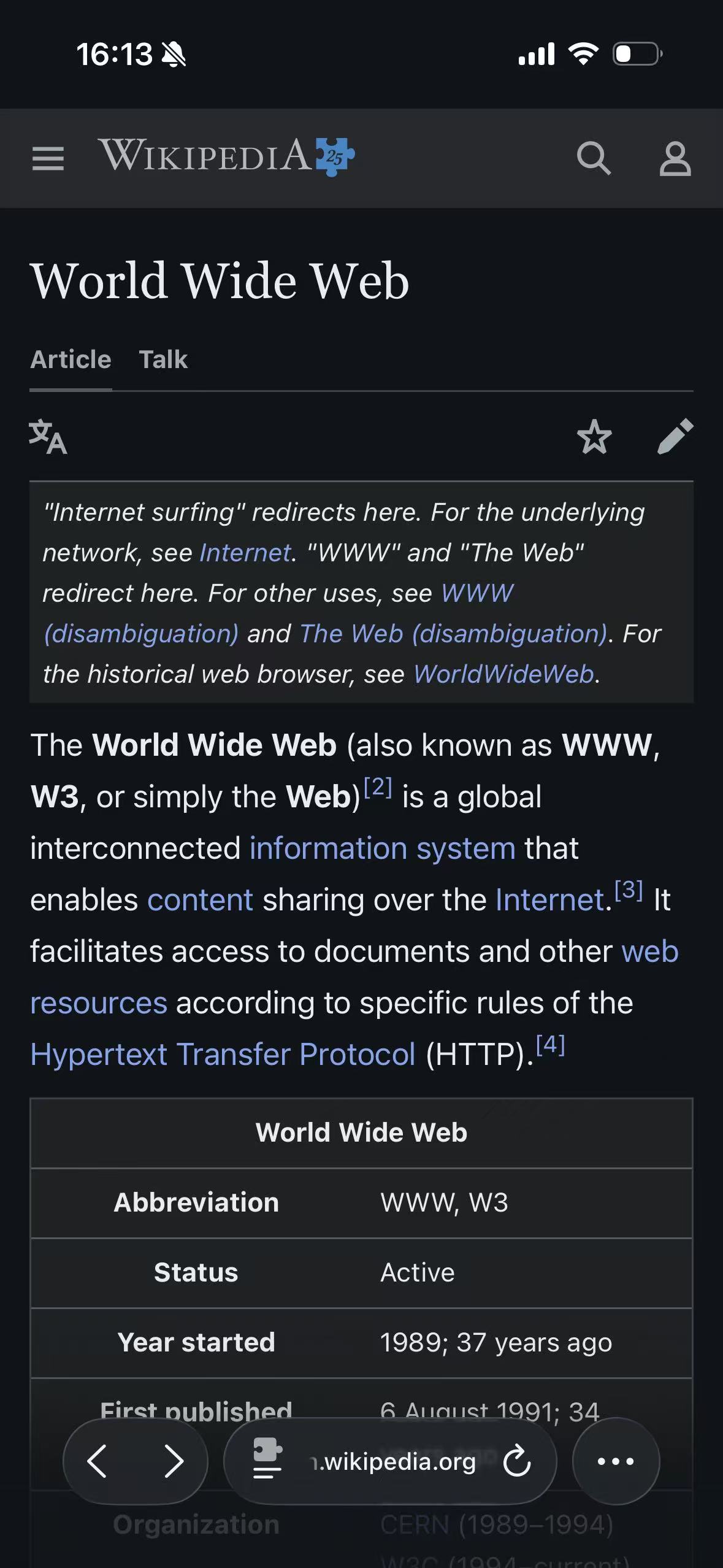
Classic Midnight is the neutral dark theme used as the starting point for a new setup. Its cool #111517 background anchor and soft #e8e6e3 text anchor are deliberately familiar: the page should feel dark without making its color palette the main event. In the Wikipedia field test below, Classic Midnight looks remarkably close to Wikipedia’s native Dark appearance. That is a useful result for a restrained article page, although the two views come from different rendering systems.
The theme’s internal configuration ID is Default. That ID describes its role in the product; it is not the public theme name. This article and the rest of the site use Classic Midnight, matching the English interface.
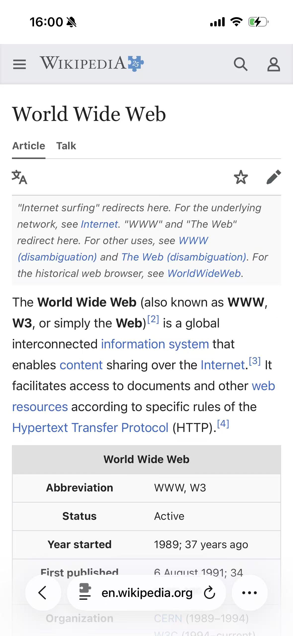
Wikipedia Light
Wikipedia native Dark
Classic Midnight
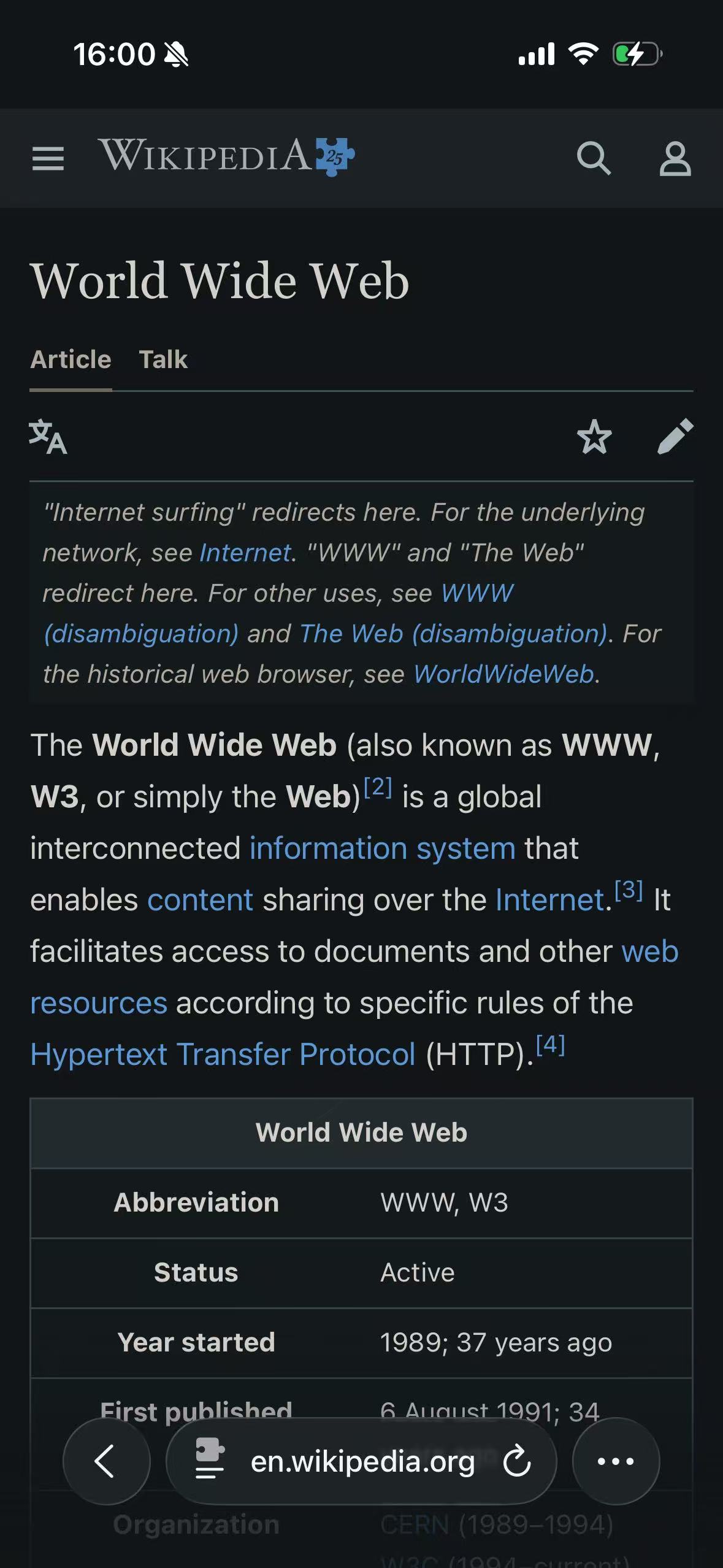
Why Classic Midnight resembles native dark mode here
Wikipedia’s article is a favorable test for a neutral dark theme. Most of the visible page consists of text, links, dividers, and a simple table. There are few branded surfaces and no product photographs or color-critical charts in the captured area. A website-designed dark theme and a careful dynamic theme therefore have room to converge.
Classic Midnight also starts from deliberately quiet colors. It has no sepia shift, grayscale adjustment, or colorful background tint. The base background is a cool near-black rather than pure black, while the text anchor is a soft off-white. On a page whose original design is already restrained, those choices produce something close to the dark appearance a site designer might choose.
The ownership still matters. Wikipedia knows which component is an article heading, navigation tab, notice, citation, and data table. An extension sees only the rendered page and its CSS. It has to infer how source colors function, then generate dark replacements. The screenshot shows that the inference is convincing in this case; it cannot prove that every menu, dialog, language variant, or future Wikipedia change will match the native theme.
For the broader distinction between these layers, see Safari Dark Mode on iPhone: What Works and What Does Not.
What the Classic Midnight preset actually ships
Classic Midnight is better described as a pair of rendering anchors than as a fixed palette painted over every element.
| Role | Current value or behavior |
|---|---|
| Base dark background | #111517, a cool near-black |
| Base light text | #e8e6e3, a slightly softened off-white |
| Brightness, contrast, grayscale, and sepia controls | Neutral defaults: no added tint or tonal effect |
| Links and accents | Derived from the page’s source colors; there is no single Classic Midnight link hex value |
| Borders and separators | Derived according to their original role and surrounding surfaces |
| Images and video | Handled separately from ordinary CSS colors so media is not treated as body text or a panel |
The two published anchor colors have a nominal contrast ratio of about 14.74:1 against each other. That number describes only the anchor pair. It is not a claim that every generated text color on every website has the same ratio: real pages contain muted labels, disabled states, overlays, translucent colors, and author-supplied combinations that the renderer must map separately.
The slight lift from absolute black is intentional. Pure #000000 can make the edge between the screen and page disappear, while bright text can feel severe beside it. Classic Midnight leaves enough room for darker and lighter page layers to remain visible without turning the whole site gray.
The page is not reduced to two colors
A flat replacement would make every background #111517 and every piece of text #e8e6e3. That would erase cards, notices, selected states, muted labels, and much of the page’s original identity. Classic Midnight instead runs through a dynamic renderer.
The renderer takes the colors already present in the page and maps them toward the theme’s dark and light anchors. Dark and light surfaces are treated differently from foreground text. Borders, shadows, gradients, and CSS variables each need their own handling. New elements inserted while scrolling or navigating also have to be considered after the first pass.
That is why the Wikipedia notice box remains distinguishable from the article background, the table keeps its grid, and links remain blue rather than becoming off-white. The goal is not to preserve every source hex code; it is to preserve the page’s hierarchy and recognizable color roles. CSS Filter vs Dynamic Theme explains why this produces a different result from inverting the finished screen.
Links, borders, and controls
Classic Midnight does not impose one branded accent on the web. A blue source link normally remains recognizably blue, adjusted so it can sit on the new background. Low-contrast separators are moved into a darker range without becoming as prominent as text. Standard controls can also adopt a dark color scheme so an input or menu does not remain bright inside an otherwise dark page.
These decisions are contextual. A faint border on white and a blue link on white should not be transformed with the same formula, even when both started as CSS colors.
Photos, video, and background images
Ordinary photographs and video should keep their visual content. The renderer does not use the two Classic Midnight anchors as a blanket tint over all media. CSS background images receive separate analysis because they may be decorative art, a repeating texture, an icon, or an image carrying text.
That protection has limits. A chart rendered into a canvas, a bitmap diagram with a white background, or an image used as part of a button can still require site-specific handling. When color itself is the information—design review, medical imagery, maps, or product color comparison—the original page is the safer choice.
Where Classic Midnight is a sensible first choice
Classic Midnight suits pages where structure and reading comfort matter more than a distinctive color mood:
- Reference articles, documentation, and technical notes.
- News and long-form reading with conventional text and image layouts.
- Forums and community pages built from repeated cards and controls.
- General browsing where one restrained global theme is easier to maintain than a strong palette.
It is also the least surprising starting point for per-site adjustments. If one domain needs a warmer palette, a Pure Black base, or a stronger color identity, that exception can be made without changing the rest of the web. The Themes index is the place to compare those alternatives as their individual field tests are published.
Classic Midnight is not automatically the best choice for every page. A complete native dark theme should normally remain in control because the site can coordinate its own illustrations, charts, logos, states, and embedded flows. Classic Midnight is useful when a site stays light, when its dark mode is incomplete, or when the reader prefers one consistent neutral treatment across several sites.
How Classic Midnight reaches the page
Selecting Classic Midnight in the companion app does more than choose two hex values. The app stores the complete preset—including rendering mode, automation, and site-level choices—in configuration shared with the Safari extension. When Safari opens an allowed page, the extension reads that configuration, checks whether the current site has its own rule, and passes the effective theme to the page renderer.
Native dark-theme detection sits in front of that work. With the normal setting, the extension leaves a site alone when it detects that the site is already presenting a dark theme. A site can be given a different theme or explicitly adapted when its native result is incomplete. This app-to-extension path is described in more detail in How Safari Dark Mode Extensions Work.
For the Wikipedia screenshot above, the site was deliberately set to Light so Classic Midnight could be observed. That is a test setup, not a recommendation to replace Wikipedia’s own complete Dark appearance.
Starting with Classic Midnight without over-configuring Safari
Use Classic Midnight globally, let the extension follow the system appearance, and change only the sites that show a real problem. This keeps the native-versus-extension boundary easy to understand and avoids building a large ruleset before it is needed. The setup sequence is covered in How to Enable Dark Mode for Websites in Safari.
Classic Midnight is the starting theme. Keep native-theme detection enabled at first; Safari permissions, embedded documents, canvas content, and color-critical media remain real boundaries.