
The Pure Black theme really does use #000000 as its background anchor. It is not a dark charcoal renamed for effect. On an OLED iPhone, that gives large empty surfaces a different physical result from Classic Midnight: black pixels do not emit visible light, while the near-black pixels in Classic Midnight still do. The distinction is easy to exaggerate, though. A webpage also contains text, links, cards, controls, photographs, and video, so selecting Pure Black does not turn the entire display off or guarantee a particular battery result.
The preset is named Pure Black in the English interface and Black in the underlying theme configuration. Both names refer to the same built-in theme.
Classic Midnight
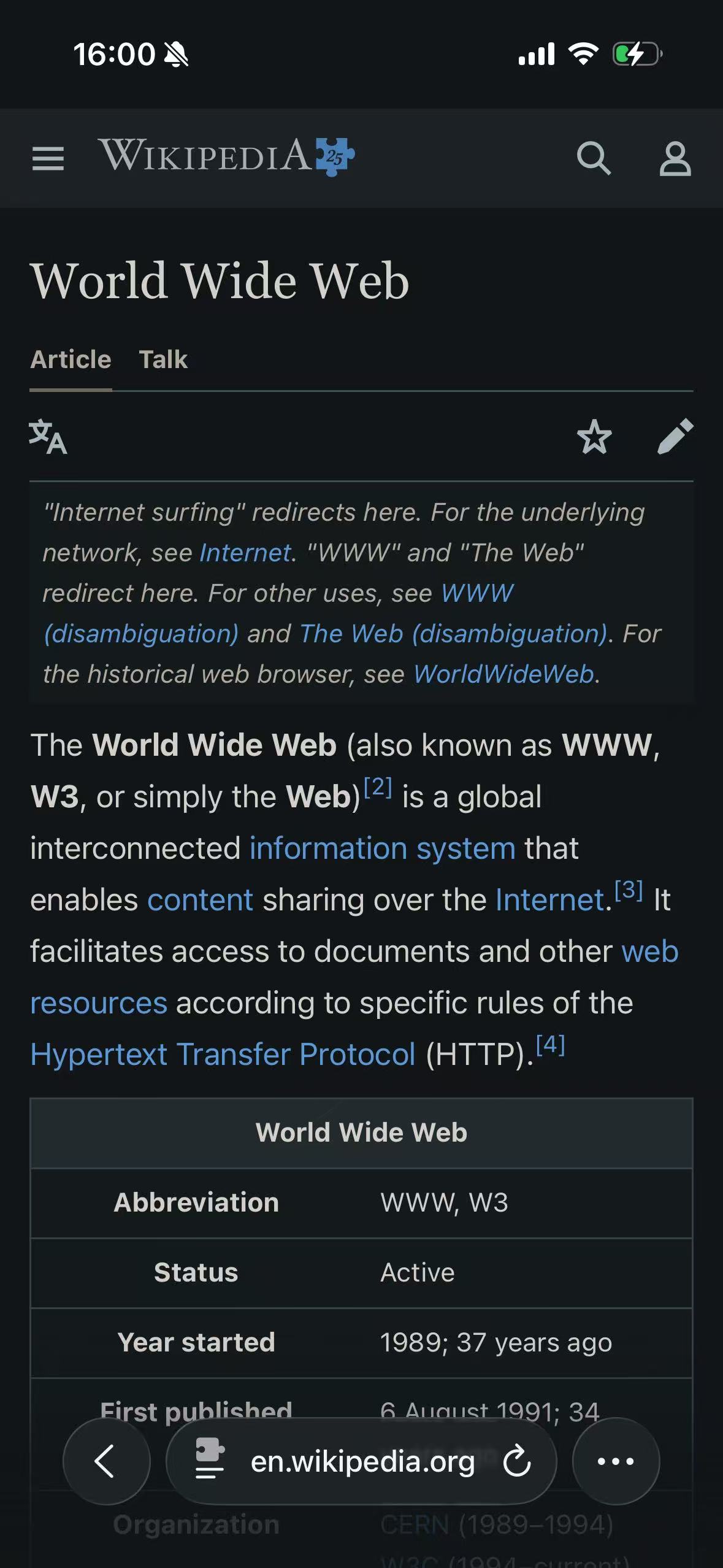
Pure Black
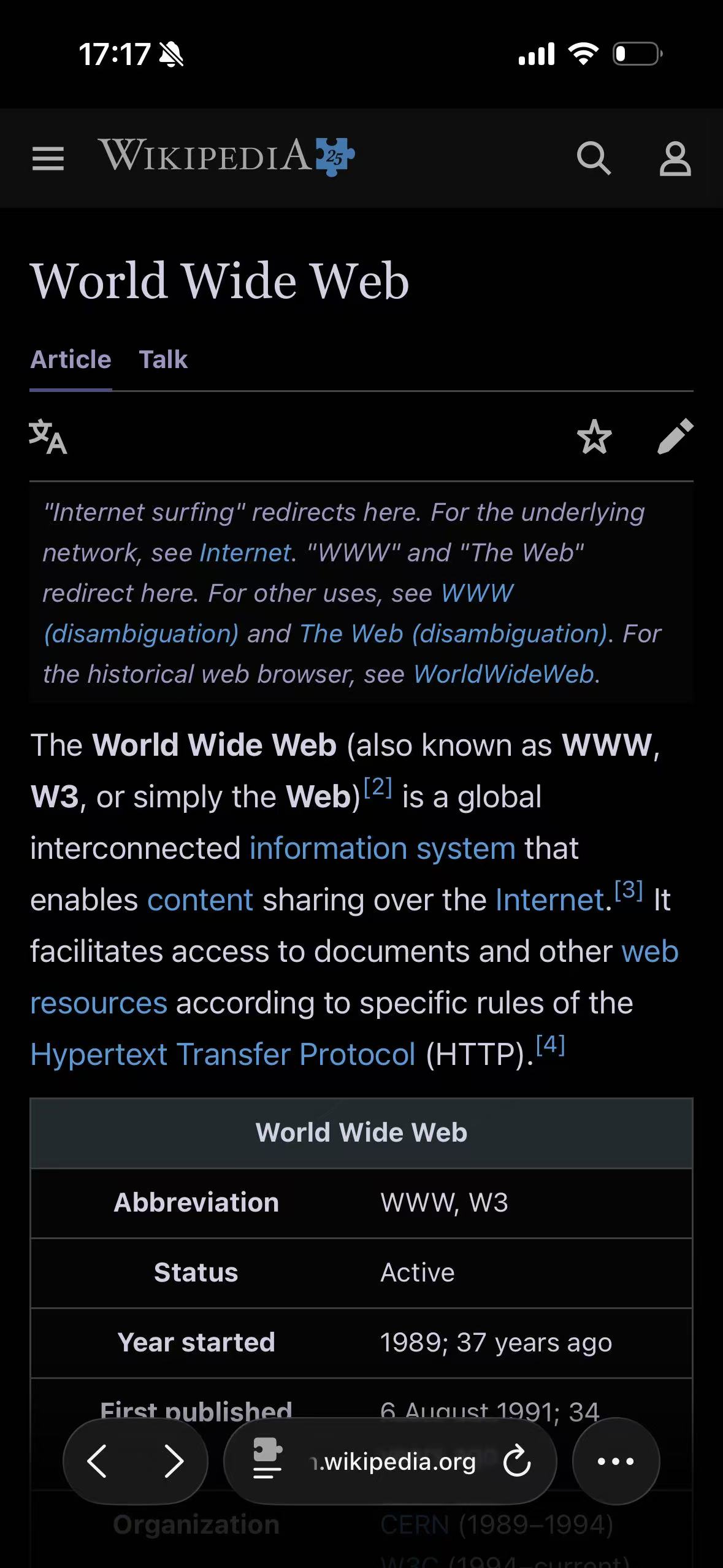
The field test confirms that the difference is real but narrower than the names may suggest. Pure Black lets the main reading canvas merge into the black display edge, and its body text appears slightly brighter. The masthead, notice box, active tab, table header, and grid do not collapse into that canvas: they retain distinct dark levels. Wikipedia’s blue links also remain recognizable. This is a pure-black base, not a one-color repaint of the site.
Pure Black is not just Classic Midnight with a darker page edge
Classic Midnight begins at #111517, a very dark cool gray, and uses #e8e6e3 as its text anchor. Pure Black moves the background to absolute black and raises the text anchor slightly to #f2f2f7. The direct anchor-to-anchor contrast therefore increases from about 14.74:1 to 18.82:1.
That numerical difference does not automatically make Pure Black more readable. Webpages rarely show only the two anchor colors. Muted text, dividers, selected states, translucent overlays, source link colors, and nested surfaces are all mapped separately. What readers are more likely to notice is the change in mood and hierarchy: the outer canvas disappears into an OLED display edge, while bright text and controls can feel more pronounced.
| Role | Pure Black behavior |
|---|---|
| Base dark background | #000000 |
| Base light text | #f2f2f7 |
| Brightness, contrast, grayscale, and sepia controls | Neutral defaults; no extra tint or tonal adjustment |
| Links and accents | Derived from the page’s source colors rather than replaced with one product color |
| Cards and secondary surfaces | Generated from their original relationship to the page; not every surface becomes #000000 |
| Images and video | Kept outside ordinary text and background mapping where the renderer can identify them |
Pure Black uses the same dynamic rendering method as Classic Midnight. The difference lies in the anchors supplied to that renderer, not in a separate “invert everything” engine.
What true black means on an OLED iPhone
Apple’s Super Retina and Super Retina XDR display documentation explains that these OLED displays have no shared backlight: light is emitted through individual pixels. A #000000 page region can therefore be physically darker than a near-black gray on an OLED panel.
This is where Pure Black has a real, narrow technical distinction. It can reduce light emitted by large background regions, particularly on simple article or interface pages. It does not follow that an entire Safari session uses no display power. White text still emits light. Blue links emit light. Photos and videos keep a wide range of luminance. Safari’s own controls and any bright embedded content remain part of the screen.
We deliberately do not attach a battery-life percentage to the theme. Actual display power depends on the panel, screen brightness, the mix of pixels on the page, motion, media, and everything else the device is doing. “Uses a black pixel” is an implementation fact; “adds a specific number of minutes” would require a controlled device-level measurement that this theme test does not provide.
Apple also notes a less-discussed OLED characteristic: at low display brightness against black backgrounds, a slight blur or color change may be visible while scrolling. That is normal panel behavior, not necessarily a failure in the webpage theme. A charcoal background can make the transition less stark for people who notice it.
Why cards and notices should not all become black
An article page is easier to follow when its layers remain visible. The main canvas, a quoted block, a warning, a table header, an input, and a floating menu do not have the same role even if the light design gave several of them white backgrounds.
A crude pure-black stylesheet would collapse those layers. The renderer instead maps each source color in context. The page canvas can reach #000000, while a raised card or notice remains slightly separated. Borders are adjusted as borders, and shadows are handled differently from foreground text. CSS variables and gradients also need to be rewritten where they feed visible components.
The result will not be a mathematically uniform black page, and it should not be. The theme’s name describes its base canvas, not a promise that every dark pixel has an identical value. CSS Filter vs Dynamic Theme explains why preserving those roles requires more than a full-page filter.
Text can feel brighter even when its value barely changes
Pure Black’s text anchor is a soft system-like off-white rather than #ffffff. Even so, text may appear sharper than it does in Classic Midnight because the surrounding canvas is darker. The eye judges contrast in context; two similar text colors can feel different when the page behind them moves from near-black to absolute black.
That makes Pure Black a preference, not an automatic upgrade. It suits people who want the display edge and page background to merge, and pages where the interface benefits from a stark, minimal canvas. For long passages, some readers will prefer Classic Midnight or Soft Dark Gray because a lifted background preserves more visible layering and reduces the black-to-text jump.
The right comparison is the page you actually read, at the brightness you normally use. A theme card in the app shows the palette direction, but it cannot reveal how a long article, a settings panel, or a dense table will feel after several minutes.
Links, photos, and video keep their own jobs
Pure Black does not replace all source colors with white. A blue link should still look like a link; a warning should not become ordinary body text; a selected tab needs to remain distinct. The dynamic renderer moves those colors into a range that can work on the new background while trying to preserve their role.
Photographs and video are a different category. Treating media as another page surface would destroy the very content the reader opened. The renderer analyzes CSS images separately and avoids applying the background and text anchors as a blanket media tint. This protection is not absolute. A chart rendered into a canvas, a bitmap diagram with a white rectangle baked into it, or an icon hidden inside a background image can still need a site-specific fix.
Pure Black can make bright media feel more prominent because there is less surrounding light. That can be useful on video-heavy pages, but it can also produce a hard black-to-white boundary around photographs or embedded documents. The theme does not crop, dim, or redesign that third-party content merely to make the page look more uniform.
When Pure Black is a good fit
Pure Black is most convincing when the page already has a simple, layered structure:
- Video and image viewers with a large outer canvas.
- Reference pages and forums where content sits in clear sections.
- Short browsing sessions where strong contrast is preferred.
- OLED iPhones when a true-black page edge is part of the desired appearance.
Choose Classic Midnight instead when you want a neutral dark theme that keeps more separation from the display edge. Soft Dark Gray is the more deliberate alternative when visible surface layering matters more than reaching the darkest possible canvas. The Themes index will use the same field-test page for every preset so those differences can be judged without changing the content at the same time.
Keep a website’s native dark appearance when it is complete. A site-designed theme can coordinate illustrations, data visualizations, logos, menus, and embedded flows with knowledge a dynamic renderer does not have. Pure Black is useful for a bright site or as a deliberate personal alternative; it is not a reason to override good native work by default.
Use Pure Black globally or only where it helps
The companion app can set Pure Black as the global theme, while a site rule can choose it for one domain without changing the rest of Safari. That narrower option is useful when a video site benefits from a black canvas but documentation remains easier to scan in Classic Midnight.
With normal native-theme detection enabled, the extension leaves an already-dark website alone. To test Pure Black fairly, set the test website to Light, confirm the extension is allowed for the page, and change only the extension theme. The setup and permission path is covered in How to Enable Dark Mode for Websites in Safari.
If the result loses a control boundary, leaves an embedded panel bright, or makes original colors harder to judge, keep the site’s native appearance or give that site a different theme. Pure Black is a strong rendering choice, not a compatibility guarantee.
Try Pure Black on one familiar site first; a site-specific rule makes the comparison reversible without turning every Safari page black.