Mint is a cool light reading theme. It maps pale page surfaces toward #EAF4EC and dark neutral text toward #2D4A3E, giving a white webpage a quiet green cast without turning it into dark mode. On the Project Gutenberg chapter below, the effect is clean and airy rather than paper-like. The page remains bright, but it no longer has the stark neutrality of a pure white canvas or the brown warmth of Sepia.
The preset is named Fresh Mint in the English interface and Mint in the underlying configuration. It is one of two built-in light themes; the other is Warm Paper/Sepia.
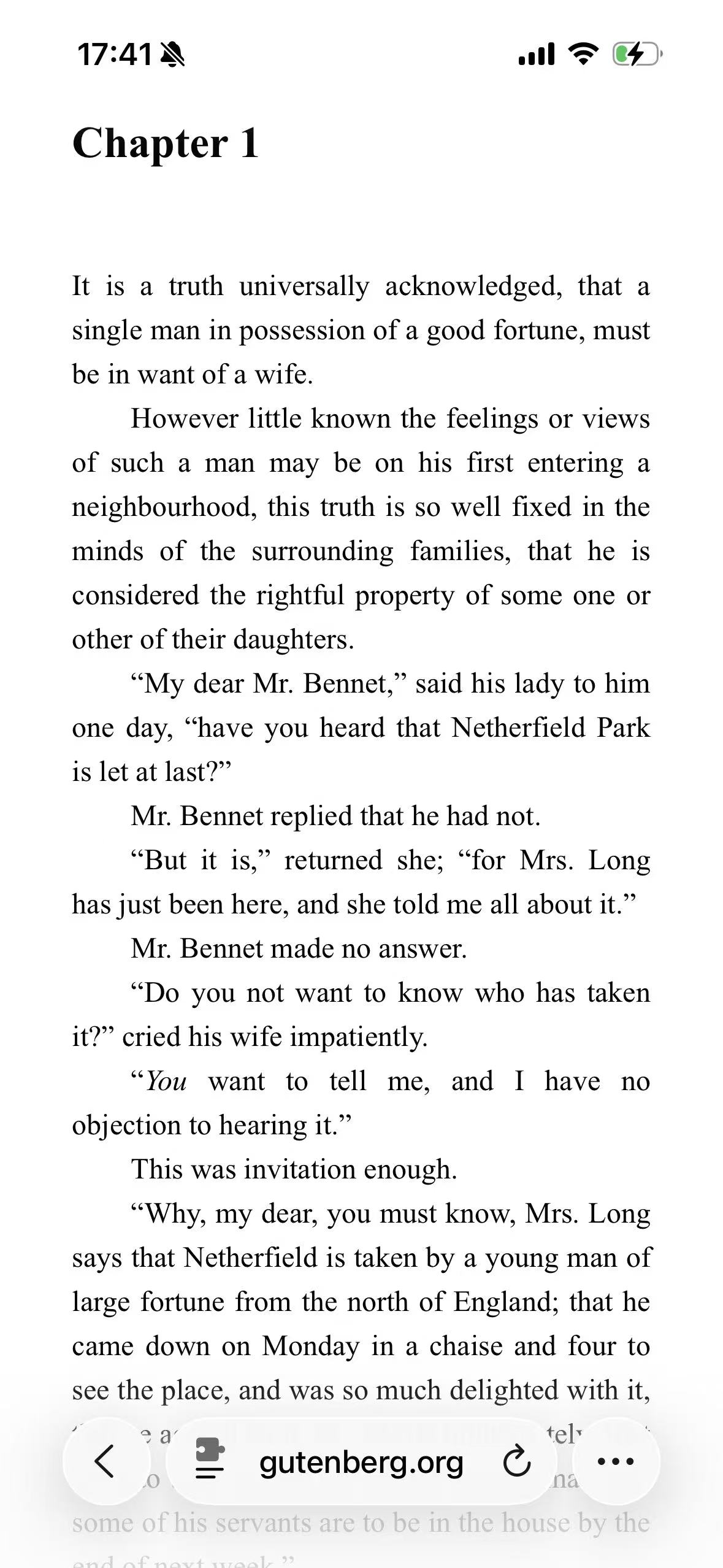
Original Light
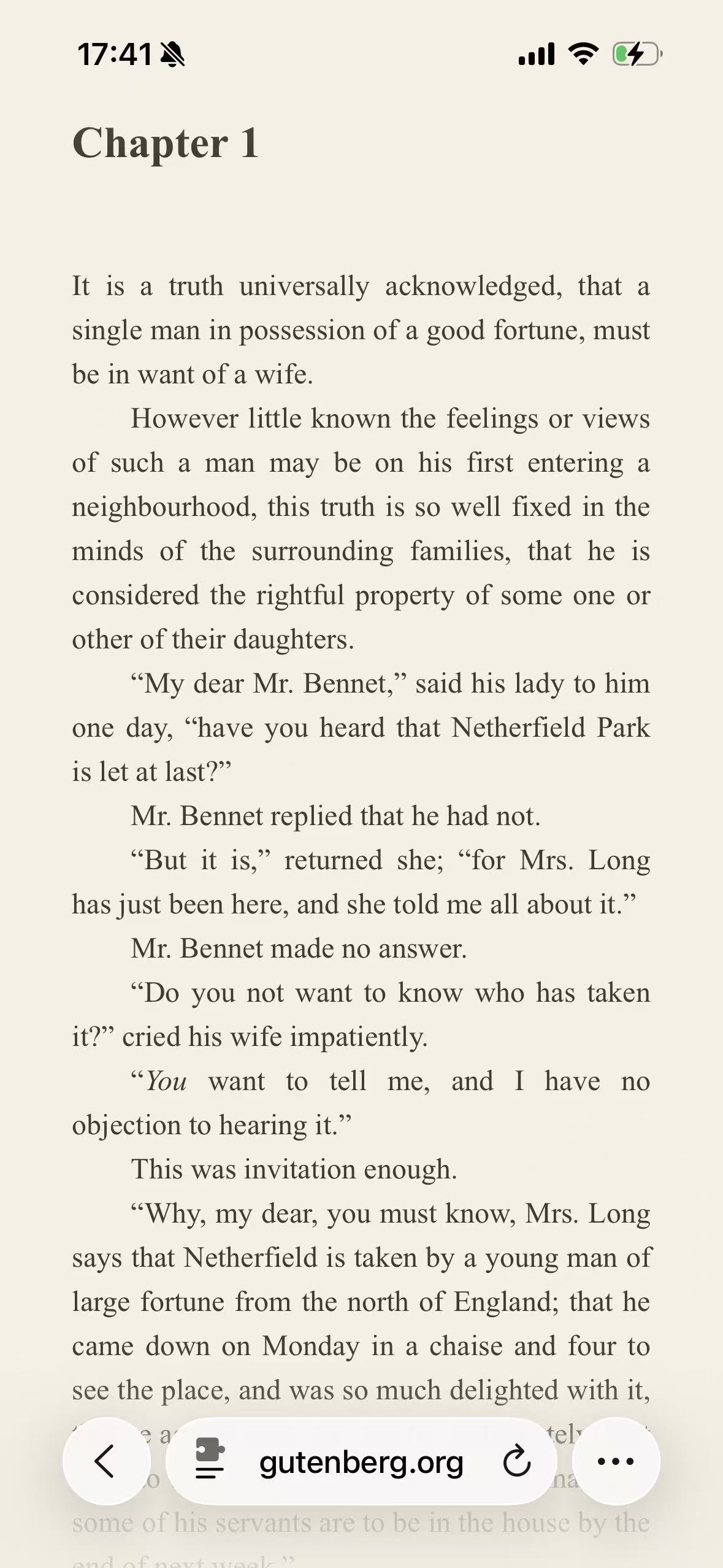
Sepia
Mint
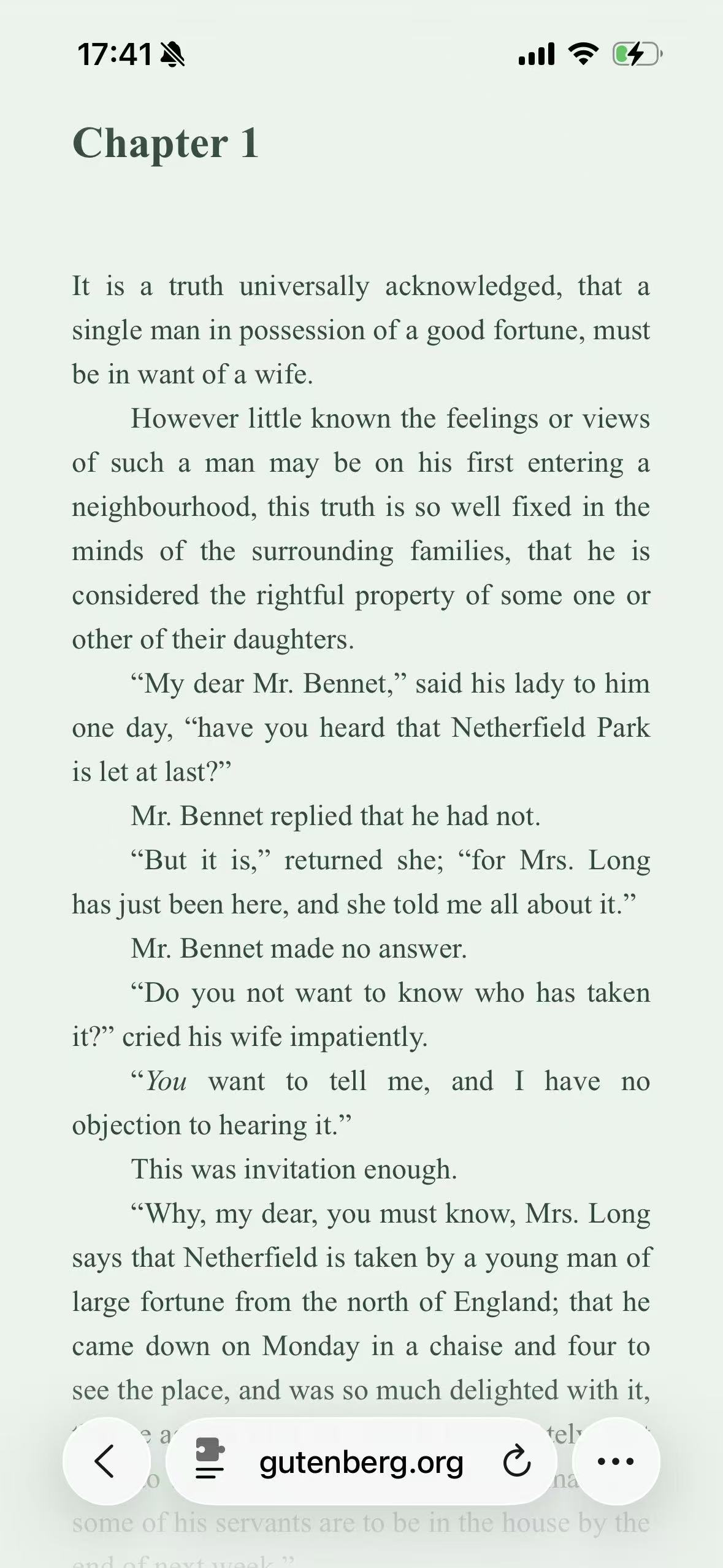
Mint is easiest to understand in the third screenshot. The green is restrained enough that the page does not look like a novelty color scheme, but it is present across the whole reading surface. The type takes on a dark green-black tone, and Safari’s translucent bottom controls reflect the page beneath them. Compared with Sepia, the result feels fresher and less like a simulated sheet of paper.
Nothing else about the chapter has changed. The heading, indents, italics, line breaks, and spacing still belong to the Project Gutenberg webpage. Mint changes the palette of that page; it does not rebuild it as an e-book reader.
Mint is light by design
Mint uses the light rendering path. Its two primary anchors are:
| Role | Mint value | What it establishes |
|---|---|---|
| Background anchor | #EAF4EC | A pale green canvas in place of neutral white |
| Text anchor | #2D4A3E | A deep green foreground in place of neutral black |
The direct contrast between those anchors is about 8.63:1. As with every theme in this series, that number describes the anchors rather than every generated element. A muted caption, visited link, disabled control, translucent overlay, or label on a colored button can produce a different contrast relationship.
The theme’s brightness, contrast, grayscale, and sepia adjustment controls remain at their neutral defaults. Mint is not a green overlay placed over a finished webpage. Its color comes from the background and text poles supplied to the dynamic renderer.
That distinction explains why the page still has intermediate tones. Serif letter edges are antialiased rather than reduced to one dark green. A pale card can remain separate from the page behind it, and a border can stay quieter than the body text. CSS Filter vs Dynamic Theme explains why those roles cannot be reproduced reliably with one full-page filter.
The clean feeling comes from hue, not from making the page darker
The original page and Mint are both light. Their difference is primarily chromatic: cool green replaces neutral white and black. That can make the screen feel visually calmer or cleaner to some readers, but it does not make the page low-luminance in the way a dark theme does.
This matters when choosing a theme by goal. If the problem is that a large bright surface feels out of place in a dark room, Mint is unlikely to be the relevant answer. The pale green background still emits substantial light. Classic Midnight or the dark brown Ristretto theme changes the page into a genuinely dark presentation.
Mint is instead for someone who wants to keep a light page while moving away from pure white and from Sepia’s cream-and-brown association. It is a visual preference, not an eye-care treatment. Screen brightness, text size, viewing distance, ambient light, and breaks still matter, and no palette is universally more comfortable.
Why a novel page reveals both the appeal and the limitation
We used the plain HTML edition of Pride and Prejudice on Project Gutenberg for Mint, Sepia, and Ristretto. The page is mostly prose and whitespace, so the palette cannot hide behind cards, illustrations, or product colors. After several paragraphs, the green cast is still the main visual fact.
That makes the chapter a useful reading test but an incomplete website test. It does not contain a form, dashboard, video player, complex navigation, or dense set of status colors. A green palette can behave differently when warnings, success states, maps, and data visualizations are already using green for meaning.
The neutral themes use Wikipedia as their field-test page for exactly that reason. Its masthead, tabs, notice, links, and table expose hierarchy in a way the novel cannot. The Themes index keeps both kinds of test together instead of pretending one screenshot represents the whole web.
Green can become part of the page’s meaning
Mint’s background is subtle on prose, but surrounding color affects how other colors are perceived. A blue link may feel different against pale green than against cream. A green confirmation message may blend more closely with the page. A product photograph with a white studio background can stand out as a neutral rectangle against the tinted canvas.
The renderer does not intentionally turn every source color green. Links and accents are derived from their original colors, and recognized images and video are handled separately from ordinary text and backgrounds. That preserves more of the website’s visual language than a blanket tint would.
The protection is not absolute. A diagram saved as a bitmap, a canvas chart, a CSS background image, or a cross-origin embedded document may not expose enough structure for the renderer to distinguish its content from its container. Color-critical work is another clear boundary. If a page is being used to judge a photograph, select a paint color, review a brand palette, or interpret a color-coded chart, the original presentation is the safer choice.
Mint is most convincing when color is atmosphere rather than data: articles, essays, documentation, forums, and other text-led pages. It is more questionable when green already carries a strong interface meaning.
Mint and Sepia are two answers to the same light-theme question
Sepia and Mint both leave the page fundamentally light. The difference is not which one is “more dark”; it is the character of the light surface.
| Question | Mint | Sepia |
|---|---|---|
| Background direction | Pale green | Warm cream |
| Text direction | Deep green-black | Dark brown |
| First visual association | Fresh, clean, lightly tinted | Paper, e-book, warm print |
| Best use case | Light reading without a paper-like cast | Light reading with a warm paper atmosphere |
| Main reason to avoid it | Green may interfere with color semantics | Brown warmth may feel heavy or old-fashioned |
The screenshot comparison is more useful than deciding from the names. “Fresh Mint” sounds more colorful than the actual page, while “Warm Paper” does not reveal how much cream will be visible on a particular display. A full chapter shows whether the tint recedes during reading or continues to call attention to itself.
Ristretto belongs nearby because it shares the reading focus, but it answers a different first question. It is dark. Choose between Mint and Sepia when a light canvas is still wanted; choose Ristretto when the canvas itself should become dark.
Keep Safari Reader out of the field test
Safari Reader can be a good way to read a supported article, but it is not the same operation as applying Mint to the website. Reader extracts the main content and supplies Safari’s own typography, spacing, layout, and color controls. The extension adapts the existing webpage, including the structure and styles that remain on screen.
For a fair comparison, open the Project Gutenberg chapter normally, allow the extension for the site, and switch only the extension theme. Read beyond the first screen. Check later headings, links, italics, illustrations, and any navigation around the chapter. The setup and site permission path is covered in How to Enable Dark Mode for Websites in Safari.
Mint can be selected globally, but a site rule is a sensible first test. A reading archive or documentation site may suit the pale green surface while stores, maps, image galleries, and design tools remain in their native appearance.
Try Fresh Mint on a text-led site before using it broadly; maps, image galleries, and any page where green carries meaning are better left in their original presentation.