Ristretto is a dark brown reading theme. It replaces the usual charcoal canvas with a coffee-colored #2c2421 background anchor and uses #d5c4a1 as its light text anchor. On a page made almost entirely of prose, the result feels closer to a night-time book page than to a dark control panel. It is still a true dark theme—the page remains much darker than Sepia—but the warm text and background remove the cool gray cast found in Classic Midnight and Pure Black.
The same preset is called Eye Care Brown in the English interface and Ristretto in the underlying configuration. “Eye Care” is a name, not a medical promise. The theme changes the page palette; it does not treat eye strain or make screen brightness, text size, distance, and breaks irrelevant.
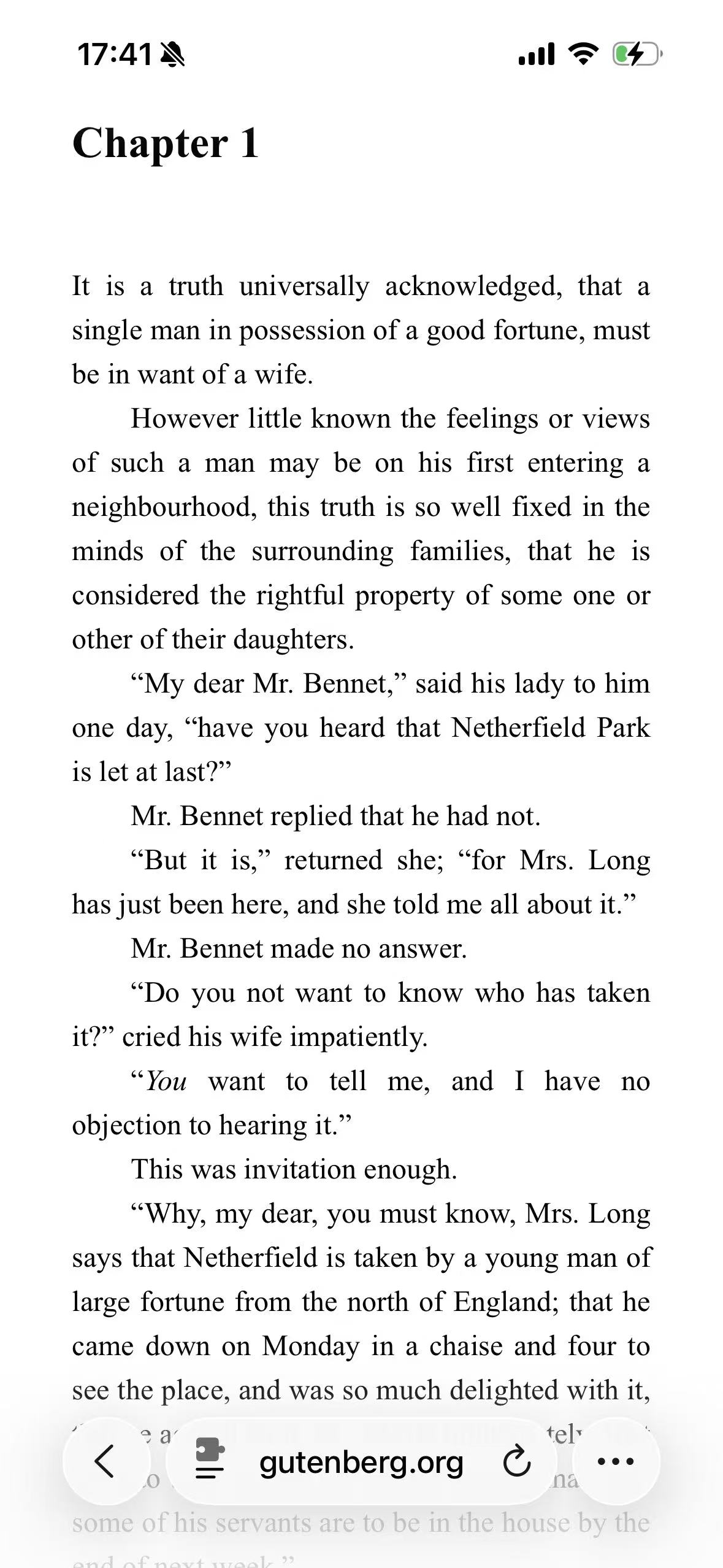
Original Light
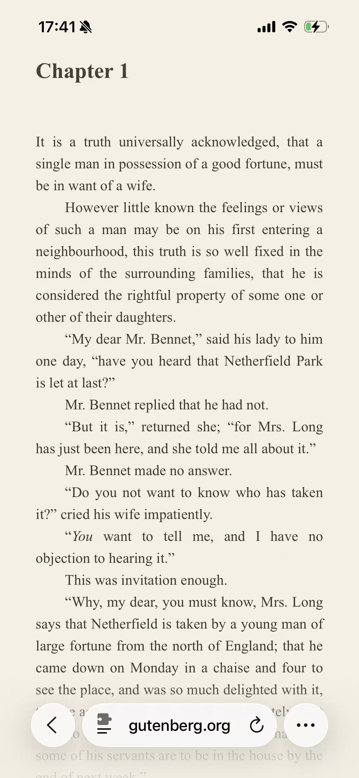
Sepia
Ristretto
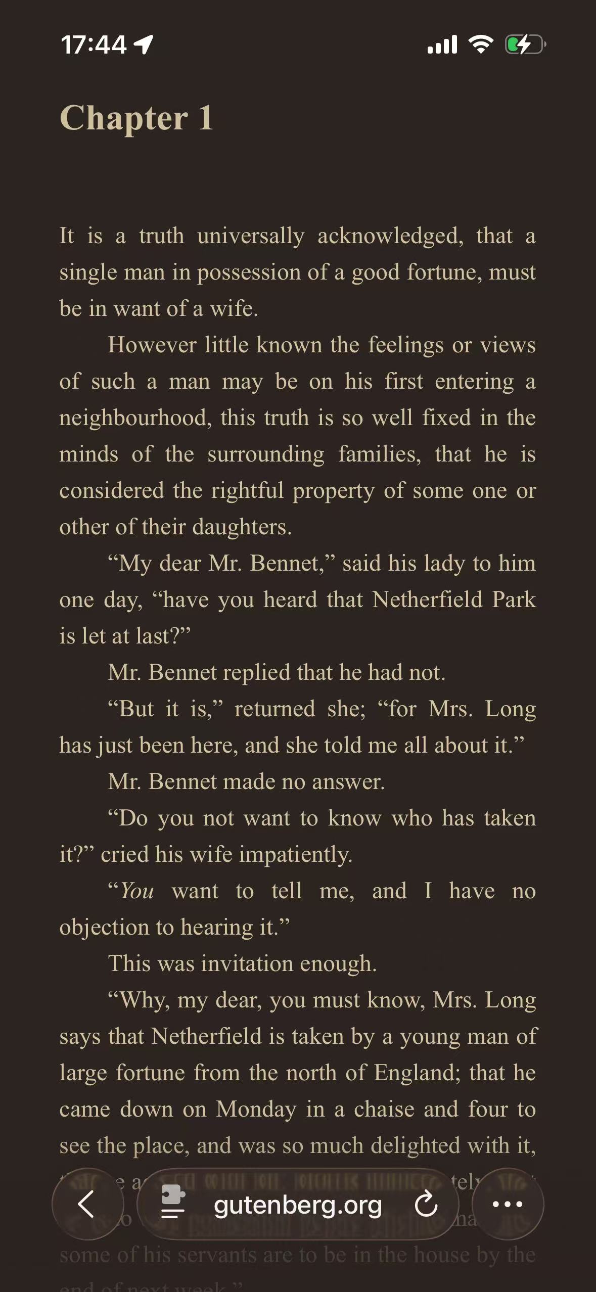
The comparison catches the difference better than a color swatch does. Sepia looks like an e-book page printed on warm paper. Ristretto keeps the same literary character but moves it into a dark room: the background becomes deep brown, the words become muted cream, and Safari’s bottom controls pick up the surrounding tone. It does not look like Sepia with the brightness turned down. The relationship between foreground and background has been rebuilt for a dark palette.
Why we tested it on a novel instead of Wikipedia
The neutral dark themes use the same Wikipedia article as their field test. That page is useful because it contains navigation, tabs, a notice, links, and a table within one screen. It exposes whether a renderer preserves interface hierarchy.
Ristretto asks a different question: what does the theme feel like over several paragraphs of uninterrupted reading? For that, we used the plain HTML edition of Pride and Prejudice on Project Gutenberg. Chapter 1 has a large heading, indented prose, italics, quotation marks, and very little decorative interface. There is nowhere for an attractive card or accent color to distract from the text itself.
That does not make a novel page a complete compatibility test. It says little about forms, dashboards, charts, video, or complex menus. It is simply the more honest page for judging a reading palette. The broader Themes index keeps the other field tests nearby when those interface details matter more.
The palette is warm, but it is not a sepia filter
Ristretto ships with two primary anchors:
| Role | Ristretto value | What it establishes |
|---|---|---|
| Background anchor | #2c2421 | A deep brown base rather than neutral black or charcoal |
| Text anchor | #d5c4a1 | A muted cream foreground rather than cool white |
Their direct contrast is about 8.86:1. That number describes the two anchors, not every item the renderer generates on a website. Muted captions, visited links, borders, translucent overlays, and colors inherited from the original page can all land at different values.
The preset’s brightness, contrast, grayscale, and sepia adjustment controls remain at their neutral defaults. The warmth comes from the two palette anchors, not from placing a uniform brown filter over the finished screen. That distinction matters. A full-screen tint would also color photographs, illustrations, video, and Safari-like controls indiscriminately. Ristretto instead supplies warm poles to the same dynamic renderer used by the Classic Midnight theme.
On the Gutenberg screenshot, the near-white page is mapped to the dark brown base while the original black type moves toward cream. Intermediate antialiasing shades remain between them, which is why the serif letter edges still look smooth rather than reduced to two flat colors.
A book-like mood is the point, not an accuracy claim
Warm brown changes how a page is perceived even when the words and spacing are untouched. The Ristretto screenshot feels less like a conventional dark website than Classic Midnight, and much less like an OLED interface than Pure Black. That is the design choice.
It is useful for novels, essays, long interviews, documentation, and other pages where reading is the main activity. The same warmth can be wrong for a product photograph, a color reference, a design review, or a chart whose hues carry meaning. The renderer does not deliberately recolor recognized photos and video as ordinary page backgrounds, but the surrounding brown canvas still changes visual context. A white image embedded in an article may also remain visibly white because that white belongs to the pixels of the image, not to the website’s CSS.
Ristretto is therefore not “more accurate” than a neutral theme. It is more opinionated. Choose it because the coffee-and-cream palette suits the material, and keep the original or a native site theme when color fidelity is part of the task.
Ristretto and Sepia belong together, but they are not interchangeable
The screenshots make the closest choice straightforward:
| Question | Ristretto | Sepia |
|---|---|---|
| Is the page fundamentally dark? | Yes | No |
| First visual association | Dark coffee, late-evening reading | Warm paper, e-book page |
| Separation from a black display edge | Visible, because the base is brown | Strong, because the page remains light |
| Effect on a long prose page | Low-luminance canvas with muted cream type | Light canvas with dark warm type |
| Best reason to choose it | You want a warm alternative to neutral dark mode | You prefer a warm light reading appearance |
Sepia can feel gentler than a pure white page without making the page dark. Ristretto goes much further: it changes which side of the contrast relationship emits most of the light. This is why calling both of them merely “brown themes” misses the practical decision.
Mint is another light reading theme, but it is not the cool counterpart of Ristretto in a strict color-theory sense. Its pale green canvas feels fresher and cleaner than Sepia’s paper tone. It deserves its own field test rather than being folded into a single article about reading colors.
What the renderer preserves beyond the two anchors
A prose page is simple, but it still contains more than background and body text. The chapter heading needs to remain stronger than the paragraphs. Italics need to stay recognizable without becoming a different color. Browser controls must stay legible above the page. Links, rules, selections, and any later illustrations need their own treatment.
The renderer maps source colors according to their role and lightness instead of assigning the two anchor values to every element. Borders stay quieter than text. Original colored accents are moved into a range that can work on the brown canvas. Recognized images and video follow separate handling so they are not painted cream and brown merely to match the page.
This is the same reason a CSS filter is not a substitute for a reading palette. A filter can make the page darker or warmer, but it also transforms media and cannot reliably preserve the relationship between nested surfaces. CSS Filter vs Dynamic Theme explains the difference at the rendering level.
There are still boundaries. Canvas content, cross-origin frames, bitmap diagrams, and website-specific CSS can produce bright areas or weak controls. A theme preset cannot know what every pixel means. When a website already offers a complete dark reading mode, that native option has the advantage of being designed alongside its illustrations, menus, and state colors.
Use it where the reading page benefits
Ristretto can be the global theme, but it is often more useful as a site-specific choice. A novel archive or essay site may suit the warm palette, while email, shopping, and technical dashboards stay on Classic Midnight or their own native appearance.
To reproduce this field test, open the same Project Gutenberg chapter in its original light presentation, allow the extension for the website, and select Eye Care Brown/Ristretto. Do not switch Safari into Reader for the comparison; Reader replaces the website with Safari’s own reading layout, so it would no longer test how the extension adapts the page. The permission and setup path is covered in How to Enable Dark Mode for Websites in Safari.
Judge the theme on more than the first screen. Read a few paragraphs, scroll through italics and headings, and check any links or images later in the chapter. If the brown cast becomes distracting, use Classic Midnight. If the dark canvas itself is the problem, Sepia or Mint is the more relevant direction.
Give Ristretto one reading site first. A per-site rule is easier to judge—and easier to undo—than forcing the same coffee palette across all of Safari.