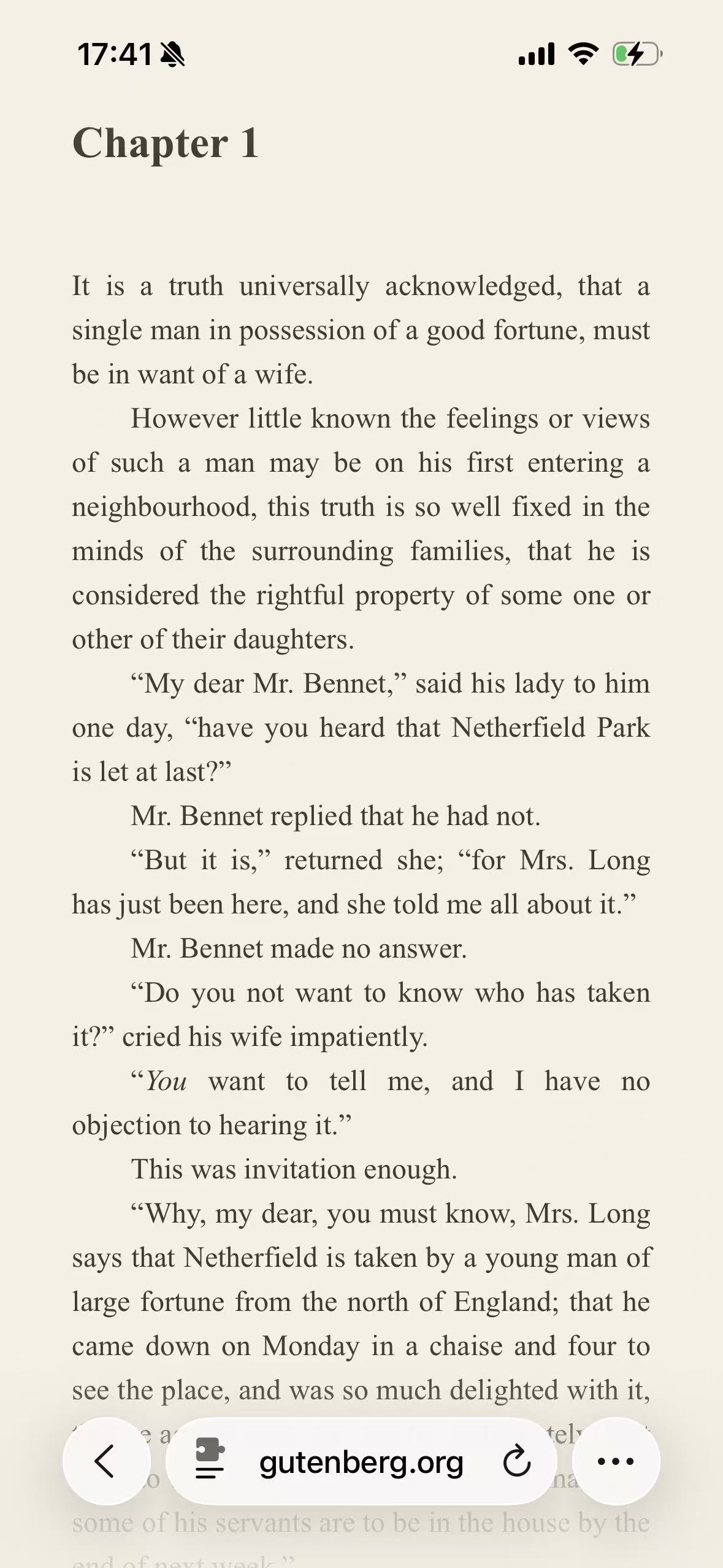
Sepia is a light reading theme, not a conventional dark mode. It replaces a white page with a warm #F6F0E4 background anchor and maps dark text toward #403A32. The change is deliberately modest: the page still feels light, but the cool white-and-black contrast takes on the character of warm paper and dark brown ink. On the Project Gutenberg test below, that is enough to make a plain browser page resemble an e-book without replacing the website with Safari Reader.
The preset is named Warm Paper in the English interface and Sepia in the underlying configuration. Both names refer to the same built-in light theme.
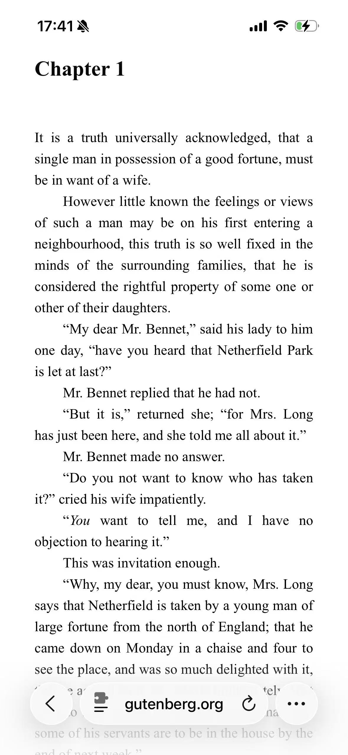
Original Light
Sepia
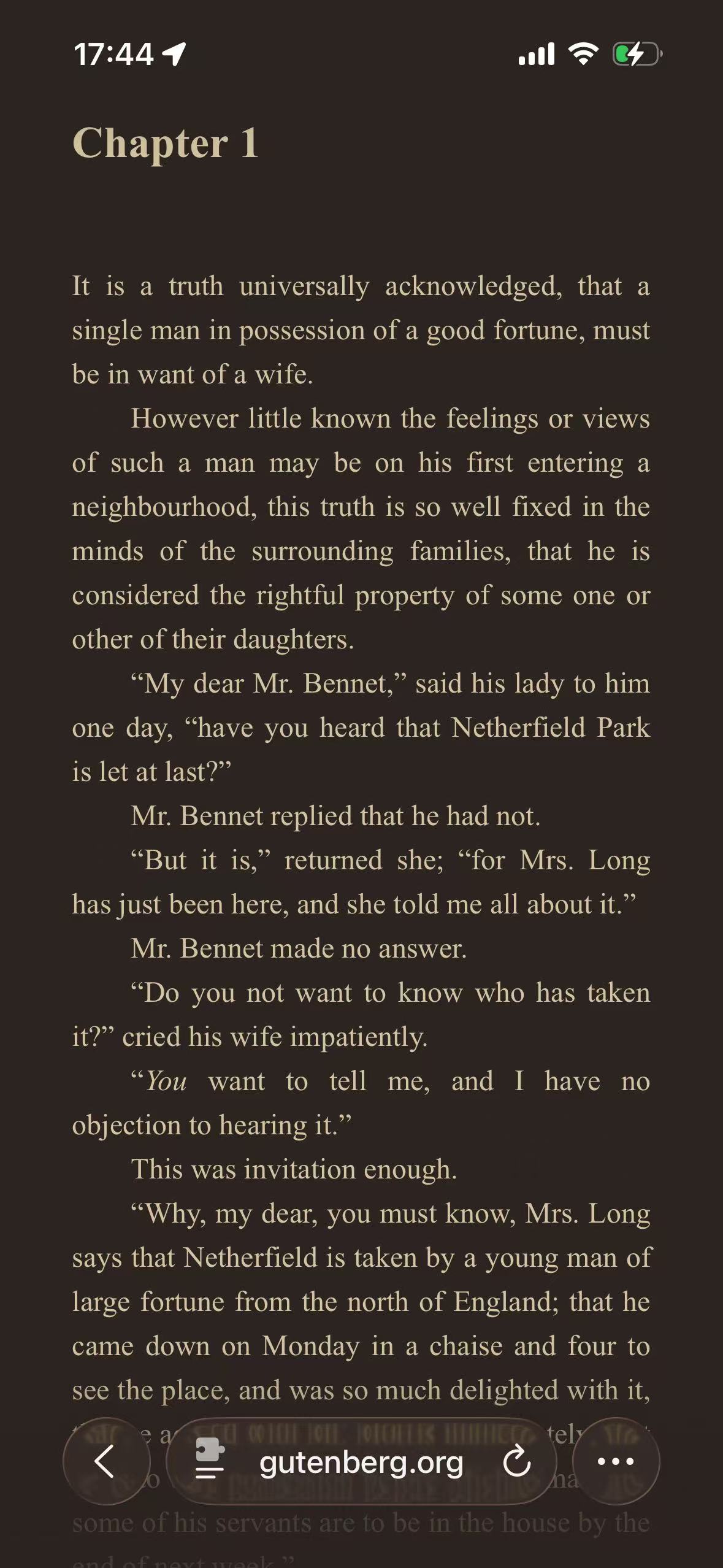
Ristretto
The middle screenshot is the important one. Nothing about the typesetting has been redesigned: Chapter 1 is still in the same serif face, with the same indents, italics, line length, and generous space below the heading. What changes is the surface underneath it. The result looks less like a bright HTML document and more like a page chosen inside an e-book reader.
That resemblance has limits. Sepia does not paginate the book, change its font, add reading progress, or remove the website around the text. It is a color treatment for the existing webpage.
Sepia uses the light rendering path
Sepia and Mint are the two built-in presets designed as light themes. In the active extension color-scheme resource, Sepia uses the following anchors for its LIGHT scheme:
| Role | Sepia value | What it changes |
|---|---|---|
| Background anchor | #F6F0E4 | Moves pale page surfaces toward a warm off-white |
| Text anchor | #403A32 | Moves dark neutral text toward a deep warm brown |
The direct contrast between those two anchors is about 9.90:1. That is not a certificate for every piece of text on every adapted page. Websites also contain muted labels, disabled controls, translucent colors, source link colors, and text placed over images. Their generated values depend on the original element as well as the theme.
Using the light path matters because a palette is more than two hex substitutions. A near-white card and the page behind it may need to remain distinguishable. A black heading and a gray caption should not become equally dark. The renderer maps lightness between the text and background poles while preserving source hue where that color has a role.
This is also why the theme is not created by applying CSS sepia() to the completed screen. A blanket filter would tint photographs, illustrations, video, and controls along with the page. Sepia gets its warmth from its palette anchors while the dynamic renderer continues to handle backgrounds, text, borders, and media according to their jobs.
Why the Gutenberg page makes the effect obvious
We used the plain HTML edition of Pride and Prejudice on Project Gutenberg because a prose page leaves very little room for visual misdirection. There is no marketing image and no colorful interface carrying the comparison. The screen is mostly background, type, whitespace, and Safari controls.
The original screenshot is already quite readable. Sepia is not fixing a broken website. It is offering a different reading atmosphere. That distinction is worth keeping because theme articles can otherwise imply that every white page has a defect waiting to be corrected.
The neutral theme tests use Wikipedia instead. Wikipedia is better for inspecting navigation, tabs, notices, table cells, and links. A novel chapter is better for deciding whether warm paper is pleasant after several paragraphs. Neither page proves universal compatibility, and the Themes index keeps the tests separate for that reason.
A paper feeling does not make the screen paper
The phrase “warm paper” describes the visual association, not the physical behavior of the display. The page still emits light. Screen brightness still matters. Text size, font rendering, viewing distance, the surrounding room, and breaks still affect how reading feels.
Sepia should therefore be chosen as a preference, not as a treatment for eye strain. Some readers like the lower color-temperature impression and the absence of pure white. Others find a cream cast distracting or prefer stronger black-on-white type. The screenshot cannot settle that question on their behalf.
It also should not be grouped with Ristretto as though one were simply a stronger version of the other. Ristretto is a dark brown theme. Its coffee-colored canvas changes which side of the page supplies most of the light. Sepia stays light and keeps a clear visual boundary between the webpage and the dark edge of an iPhone display.
If the goal is a genuinely low-luminance page for a dark room, Sepia is the wrong direction. Start with Classic Midnight or Ristretto instead. Sepia is for readers who want to remain in a light presentation while moving away from stark white.
The renderer still has to understand a webpage
Project Gutenberg’s chapter looks simple, but its clean result depends on more than recoloring the body element. Headings, paragraphs, italic emphasis, link states, rules, and later illustrations can all introduce different source colors. On a larger publication, the same theme may encounter cards, menus, form fields, highlighted passages, and embedded documents.
The renderer derives those colors from the original page rather than flattening everything to cream and brown. Borders stay less prominent than text. Links retain a visible link color. Recognized photographs and video are kept outside ordinary foreground/background conversion where possible.
That separation is especially important in a light theme. A photograph does not need to be “made light” because the surrounding page is light, and tinting it brown would destroy its color. A bitmap scan with white pixels baked into the image may still show a white rectangle, however. The extension can adapt CSS colors around an image; it cannot safely reinterpret every pixel inside third-party artwork.
The technical difference between mapping page roles and filtering the final screen is covered in CSS Filter vs Dynamic Theme. The limits remain real: canvas graphics, cross-origin frames, background images, and unusual website CSS can still need site-specific handling.
Choosing between Sepia, Mint, and Ristretto
These three themes work well on the same reading test because their intent is easy to see without changing the content:
| Theme | Fundamental appearance | Visual character | Choose it when |
|---|---|---|---|
| Sepia | Light | Warm paper with dark brown text | You want a softer-looking alternative to white |
| Mint | Light | Pale green, clean, and comparatively cool | You want a fresh light page without the paper tone |
| Ristretto | Dark | Deep coffee with muted cream text | You want a warm reading palette on a dark canvas |
Mint is not “Sepia in green.” Its pale green surface changes the mood of the page, and its dark green text anchor creates a different relationship with links and accents. It deserves its own field test rather than a short palette note inside this article.
The same is true of Ristretto. The shared warmth makes it Sepia’s closest conceptual neighbor, but the light/dark decision comes first. If a reader dislikes a bright canvas, changing from white to cream is unlikely to solve the actual preference.
Keep the website intact while testing the palette
To reproduce the screenshots, open the Project Gutenberg chapter in its normal webpage view, allow the extension for the site, and select Warm Paper/Sepia. Do not enable Safari Reader for this comparison. Reader extracts the article and applies Safari’s own layout, type, and color choices; at that point the test is no longer showing how the extension adapts the website.
Read beyond the opening paragraph. Check the heading, italic text, links, any illustrations, and the transition into later sections. A theme that looks attractive in a small swatch can feel very different across a full chapter.
Sepia can be used globally, but a per-site rule is often the better starting point. A novel archive, essay publication, or documentation site may suit Warm Paper while shopping, maps, image galleries, and design tools remain in their original presentation. How to Enable Dark Mode for Websites in Safari covers the permission and site-specific setup path.
Warm Paper makes the most sense as a per-site reading choice; leave photographs, design tools, and other color-critical pages in their original appearance.