
Gray is the neutral preset that makes the page surface visibly separate from the black edge of an iPhone. In the same Wikipedia test used for Classic Midnight and Pure Black, that one change makes the masthead, article canvas, notice, dividers, and table easier to read as different layers. The text is also less bright against its background. Gray is therefore not a weaker version of dark mode; it is the option for readers who prefer visible structure over the deepest possible canvas.
The theme is named Soft Dark Gray in the English interface and Gray in the underlying configuration. Both names refer to the same built-in preset.
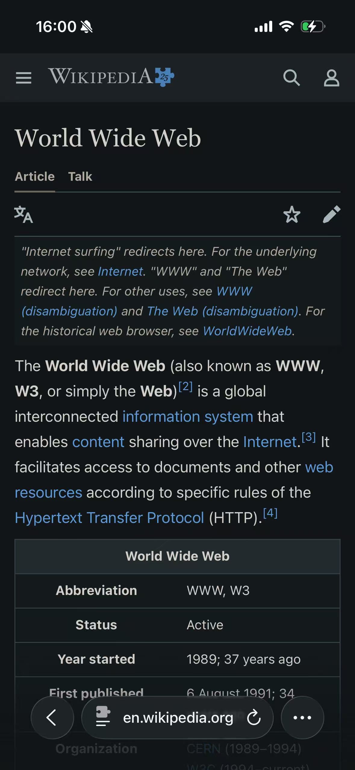
Classic Midnight
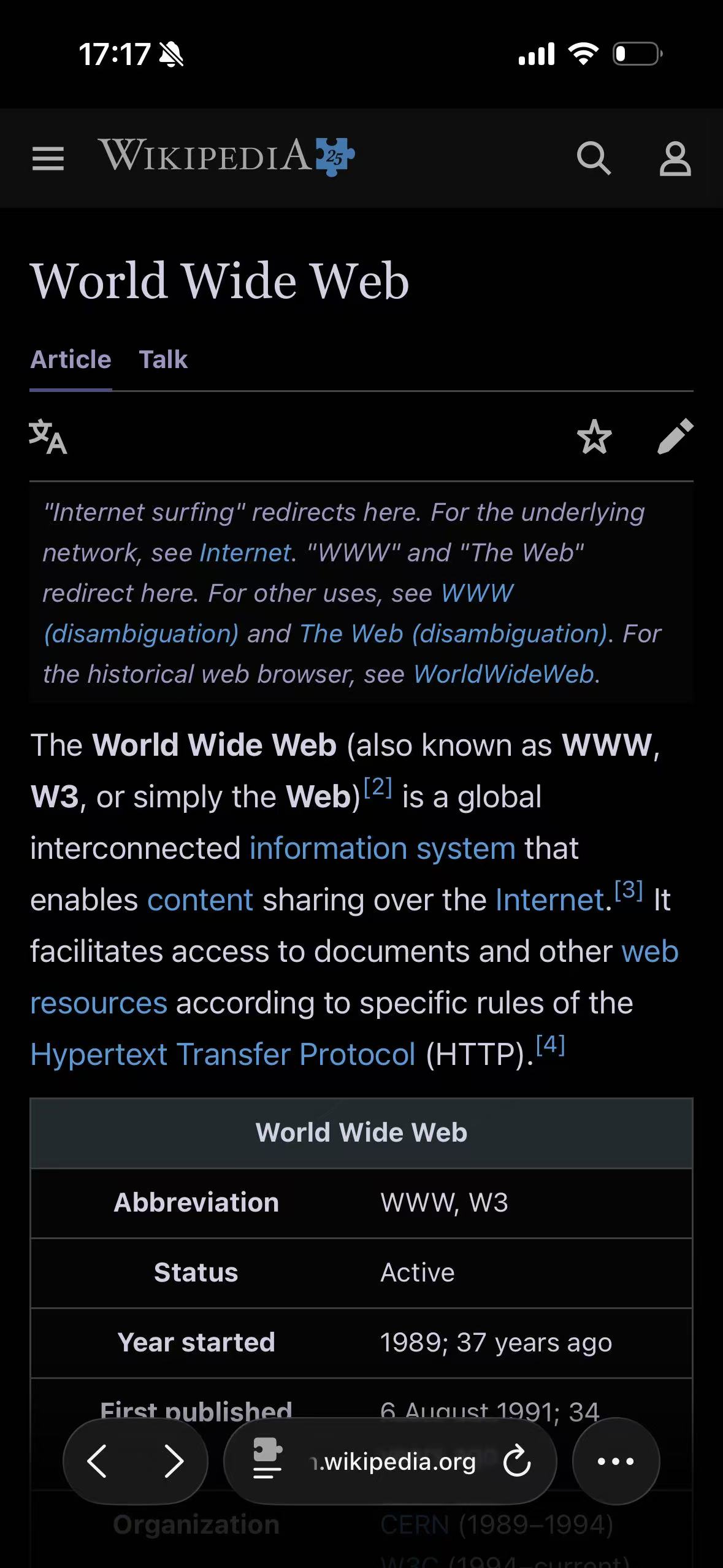
Pure Black
Soft Dark Gray
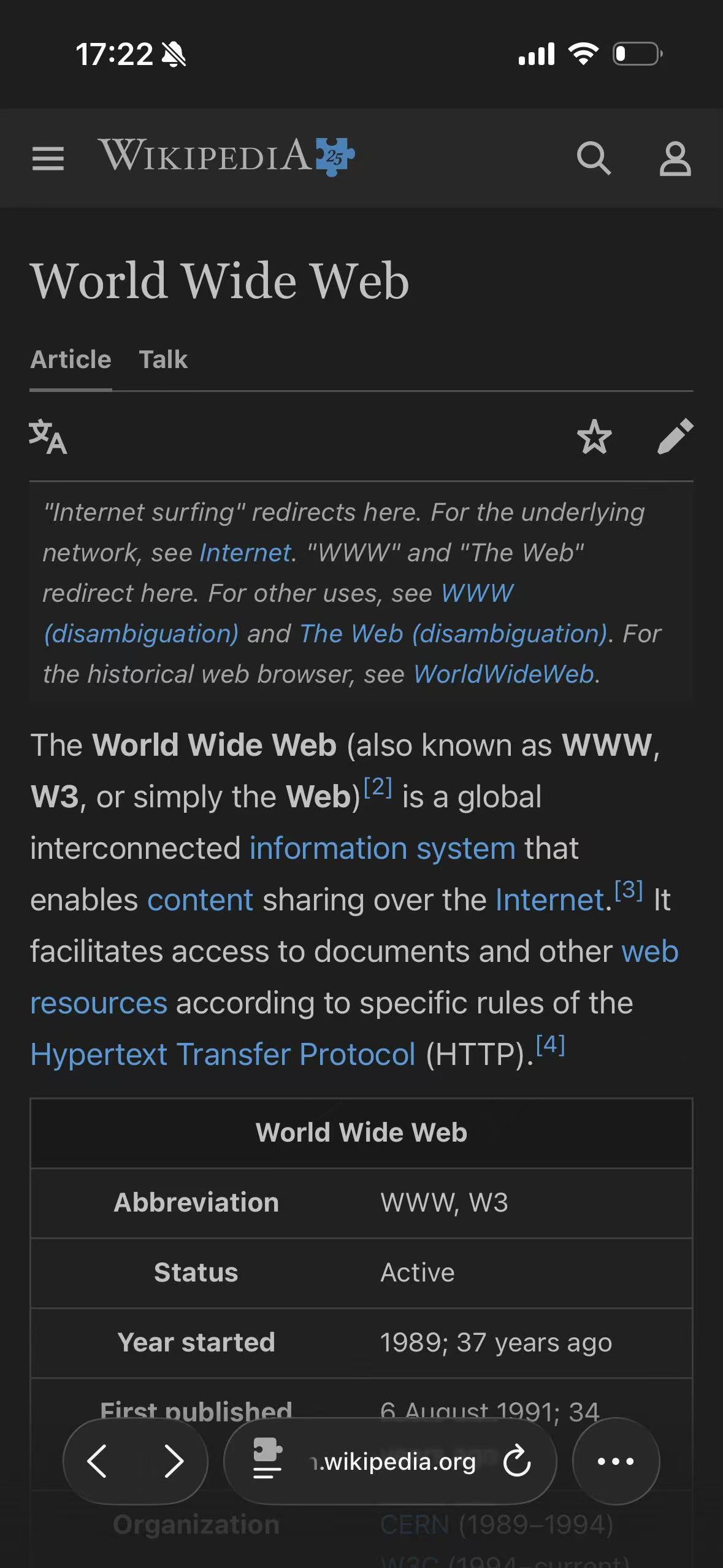
The screenshot shows the tradeoff clearly. Pure Black makes the article canvas disappear into the display edge. Classic Midnight lifts it slightly. Gray keeps the whole page unmistakably dark while revealing more separation between the page, the darker notice, the top navigation, and the table cells. Blue links remain blue in all three; Gray does not turn Wikipedia into a monochrome document.
The neutral themes are solving different problems
It is tempting to arrange Pure Black, Classic Midnight, and Gray on a simple “darkest to lightest” scale. Their base colors do follow that order, but the practical choice is about more than brightness.
| Theme | Background anchor | Text anchor | Direct anchor contrast | Most visible characteristic |
|---|---|---|---|---|
| Pure Black | #000000 | #f2f2f7 | 18.82:1 | Canvas merges with a black OLED edge |
| Classic Midnight | #111517 | #e8e6e3 | 14.74:1 | Neutral middle ground with a cool near-black base |
| Gray | #1e1e1e | #d4d4d4 | 11.25:1 | Page layers remain easier to distinguish |
These ratios compare only each theme’s two anchors. They are useful for understanding the direction of the presets, not for certifying every generated element. A real website contains muted labels, translucent colors, author-supplied link colors, disabled controls, and surfaces derived from many different source values.
Gray’s lower number is deliberate. The preset lowers both ends of the visual jump: its canvas is lighter than Classic Midnight, and its text anchor is darker. That reduces the stark black-and-white effect without turning the page back into a light theme.
What Soft Dark Gray actually controls
The two anchors guide the dynamic renderer; they do not replace every source color with one gray background and one gray text color.
| Page role | Gray behavior |
|---|---|
| Main background | Mapped toward the #1e1e1e base |
| Main text | Mapped toward the #d4d4d4 text anchor |
| Secondary surfaces | Kept distinct according to their relationship with the original page |
| Borders and dividers | Adjusted without giving them the same prominence as text |
| Links and accents | Derived from source colors rather than forced to gray |
| Photos and video | Handled separately from ordinary CSS backgrounds and foregrounds |
Brightness, contrast, grayscale, and sepia adjustments stay at their neutral values in the preset. Despite its name, Gray does not apply a grayscale filter to the final screen. Wikipedia’s blue and purple link states in the screenshot are a simple proof of that distinction.
The same renderer is used by Classic Midnight and Pure Black. Changing the theme changes its color anchors and the results derived from them; it does not switch to a flatter rendering method.
Page hierarchy is where Gray earns its place
Many websites are built from layers that happen to share a white or very light background: the document, cards, inputs, menus, notices, table headers, and dialogs. A dark renderer has to preserve those relationships after moving them into a much narrower dark range.
Pure Black has plenty of room above its canvas for cards and controls, but the base itself can disappear into the device edge. Classic Midnight keeps a little separation. Gray makes the page boundary obvious before the reader has to infer it from borders or spacing.
The Wikipedia test contains several small examples. The masthead sits on its own dark band. The italic redirect notice remains a separate block. Horizontal dividers are present without becoming white rules. The table header is darker than the body rows, and the grid is visible without competing with the text. None of those details is dramatic alone; together they make the page feel organized.
This is also why a flat opacity layer or full-page filter is not an equivalent implementation. It can dim the whole screen, but it cannot reliably decide which near-white surface was a card and which was the page behind it. CSS Filter vs Dynamic Theme covers that rendering difference.
Softer contrast is a preference, not a readability guarantee
Gray can make large passages feel less stark because the text and canvas are closer together than they are in Pure Black. That does not establish that Gray is more readable for every person, every font, or every room. Text size, weight, line spacing, screen brightness, the original website, and individual vision all affect the result.
The safest way to choose is to compare a familiar page at the brightness you normally use. Look beyond the first heading. Read body text, inspect a muted caption, open a menu, and check a form or table. A theme can look attractive in a small preview while making secondary information too quiet on a real site.
Gray is not intended to reproduce the OLED behavior of a pure-black canvas. Its #1e1e1e background remains visibly illuminated on an OLED display. Choose it for its visual layering and contrast balance, not for a claim about turning background pixels off.
Color and media remain part of the website
A neutral gray canvas can make source colors appear more restrained, but the theme does not intentionally remove them. Links need to remain identifiable, selected tabs need a state, and warnings should not become ordinary text. The renderer maps those colors for the new background while trying to keep their original job.
Images and video need a different boundary. A photograph should not inherit the Gray text anchor, and a video should not be washed with a gray overlay merely to match the page. The renderer handles recognized media separately, although a bitmap diagram, canvas chart, CSS background image, or cross-origin embedded document can still require site-specific treatment.
Gray is often a reasonable surrounding surface for mixed-media pages because it does not create the hardest possible edge around a bright image. It still cannot correct artwork that has a white background baked into the pixels, nor should it alter color-critical material just to make the page aesthetically uniform.
When Gray is the useful choice
Soft Dark Gray makes sense when the page’s internal structure matters more than reaching absolute black:
- Documentation, reference pages, and long tables.
- Dashboards and settings pages with nested panels and controls.
- Forums, feeds, and stores built from repeated cards.
- Readers who find Pure Black or Classic Midnight visually sharper than they prefer.
Classic Midnight remains the more neutral starting point when you want a darker canvas without the full Pure Black effect. Pure Black is the deliberate choice when a black page edge is part of the goal. The Themes index keeps these field tests together so the content and viewport do not change while the palette is being judged.
Use a website’s native dark appearance when it is complete. The site can coordinate charts, logos, images, state colors, and embedded flows with information an extension does not possess. Gray is most useful for bright sites, incomplete native themes, or a personal site-specific preference.
Apply Gray only as broadly as needed
Gray can be used globally or assigned to one website while the rest of Safari stays on Classic Midnight. Start with the narrower rule if only a documentation site or dashboard benefits from the extra surface separation.
To reproduce the comparison above, set Wikipedia to Light, allow the extension on the page, and change only the extension theme. How to Enable Dark Mode for Websites in Safari covers the permission and setup path.
The useful test is not the small theme preview in the app. Assign Soft Dark Gray to one layered site, such as documentation or a dashboard, and keep the original presentation for color-critical work.