
A dark mode extension should transform the page’s visual system without recoloring the content people came to see. Text, cards, borders, and controls can move into a dark palette; photographs, product colors, video frames, logos, and charts often need to remain recognizable. That is a separate problem inside the broader dynamic dark mode rendering pipeline, not a finishing touch applied after the CSS is done.
That separation is harder than it sounds. The same image file can be a photograph, a transparent icon, a white texture, a diagram, or a fake page background. Media protection therefore combines element type, CSS context, lightweight image analysis, and site-specific exceptions.
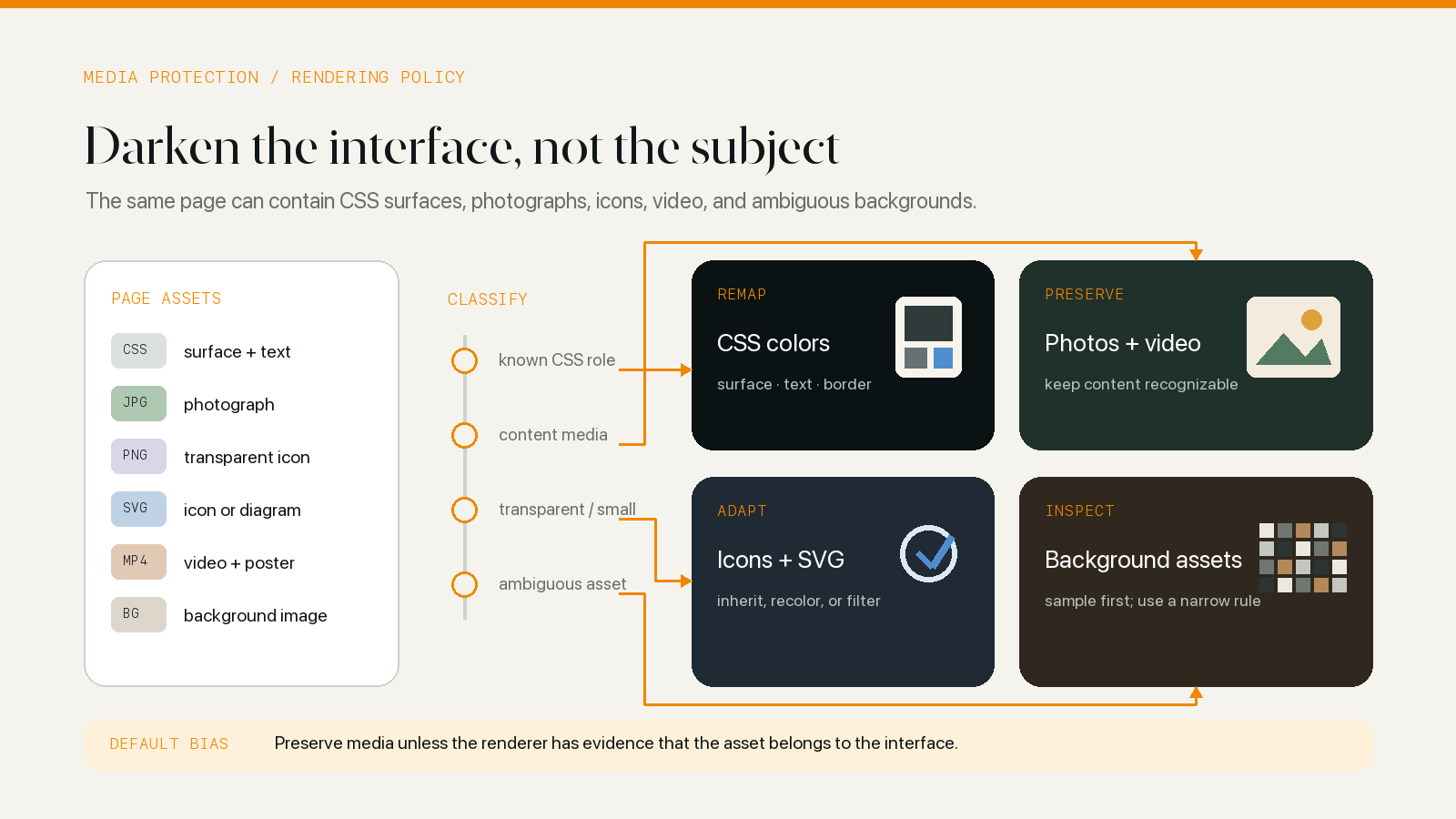
The boundary between interface and content
A page-wide invert() filter does not know which pixels are interface and which are content. It transforms them together. A second inverse filter on img and video can cancel the most obvious damage, but nested components and background images quickly complicate that rule.
Consider a shopping card that contains:
- A white card surface.
- A transparent PNG of a black shoe.
- A red sale badge.
- Gray secondary text.
- A small SVG wishlist icon.
The surface and text should change for dark mode. The shoe color and sale meaning should not. The icon may need to follow the new text color. One filter on the card cannot make all those decisions correctly.
WebKit’s own dark mode guidance recommends direct color styling for accuracy and notes that filters are better scoped to specific images that cannot be styled another way: Dark Mode Support in WebKit.
Start by preserving ordinary media
The safest baseline is conservative:
- Do not recolor photographs and video frames by default.
- Do not assume a large image is a page surface.
- Do not shift product swatches, maps, charts, or account avatars without evidence.
- Let known monochrome icons and decorative backgrounds follow the theme when their role is clear.
The compatibility configuration includes broad protection for images, video, embedded objects, and SVG image content, plus more specific rules for individual sites. The dynamic renderer can still analyze CSS background images because those often behave like interface rather than standalone content.
Background images are ambiguous
CSS background-image is used for very different jobs:
- A repeating texture behind text.
- A large hero photograph.
- A one-pixel solid-color asset.
- A transparent icon in a button.
- A gradient combined with a URL image.
- A light illustration that assumes a white page.
The HTML element type does not reveal the role because all of these appear as a CSS property. A dynamic renderer needs to parse the background value, preserve gradients separately, resolve the image URL, and decide whether the bitmap should be changed.
Tiling and stretching matter. Inverting a small, non-repeating icon can be reasonable. Applying the same transformation to a tiled texture or a cover photograph can create a large, obviously altered surface. The renderer checks background repeat and size before using an element-level inversion fallback.
A reduced pixel sample provides clues
The renderer analyzes a reduced sample rather than processing every full-resolution pixel. The sample is used to classify broad properties:
- Is most of the opaque image dark?
- Is most of it light?
- Does it contain meaningful transparency?
- Is the source physically large?
- Is it close to one solid color?
This classification can distinguish several useful cases.
A small, mostly dark, transparent image is often an icon designed for a light background. It may need inversion so it remains visible on a dark surface. A light, opaque, nearly solid image may really be a bitmap used as a background color and can be replaced with a generated dark solid. A large light image is more likely to be content or a hero surface, so aggressive transformation carries more risk.
The analysis is heuristic. A black product photo on transparency can look like a dark icon. A white logo can look like a decorative surface. Classification narrows the decision; it does not identify semantic intent.
Transparency changes the decision
Transparency is a strong clue because transparent assets depend on the background underneath.
A dark opaque photograph can remain readable on a dark page because it carries its own background. A dark transparent icon can disappear when the page surface changes from white to charcoal. Inverting or recoloring the transparent icon may be necessary.
Alpha also complicates solid-color detection. An almost uniform asset with transparent edges is not the same as an opaque one-pixel background. The renderer should keep transparency statistics separate from average RGB values and avoid dividing by nonexistent opaque pixels.
The correct outcome is often based on the pair asset plus destination surface, not on the image alone.
SVG and video need opposite defaults
SVG sits between CSS and bitmap media. A simple inline icon can use currentColor and follow the surrounding text automatically. An external SVG can contain fixed fills, embedded raster images, gradients, masks, text, or an entire diagram.
Possible strategies include:
- Let inline
currentColoricons inherit the transformed foreground. - Transform CSS-visible SVG fills when they behave like interface colors.
- Preserve embedded
<image>content. - Apply a generated filter to a small external SVG when analysis indicates a monochrome asset.
- Use site-specific rules for logos and diagrams whose meaning is known.
The current implementation also accounts for SVG files that define only a viewBox without explicit dimensions when creating a filtered representation. That detail prevents a browser drawing quirk from producing an incorrectly sized result.
Video should normally remain untouched
The pixels inside a video are content. A dark theme may change the player shell, timeline, buttons, menu, transcript, and surrounding page, but it should not invert the video frame.
Video players are still complicated because the media element can be wrapped in:
- A poster image before playback.
- Custom SVG controls.
- Captions and transcript panels.
- A full-screen iframe.
- Bright overlays inserted by the website.
Global media protection and site-specific player rules work together. The goal is not “never style anything near a video.” It is “preserve the frame while adapting the interface around it.”
Cross-origin loading and browser policy matter
To analyze a CSS image, the extension needs image data. Same-origin resources can be loaded directly. Cross-origin resources may need the extension background layer to request the asset in a way allowed by its permissions and browser policy.
Content Security Policy, blob URL support, data URL size, failed requests, and unsupported formats can all prevent a filtered representation from being created. A responsible fallback is to leave the original image or use a narrowly scoped element filter when it is safe—not to hide the content because analysis failed.
This analysis is part of on-device page adaptation. The extension loads the resource referenced by the page and analyzes a reduced pixel sample locally; that is different from uploading page images to a remote image-analysis service.
Site rules and bounded work keep it practical
General analysis cannot know that one selector is a company logo, another is a QR code, and a third is an account chart. Compatibility rules provide semantic knowledge the pixel sample does not have.
Useful rule types include:
- Invert a known monochrome logo or toolbar icon.
- Never invert product media or a video region.
- Skip image analysis for a selector whose assets are too varied.
- Remove or replace a decorative background that conflicts with the dark surface.
- Add CSS for a site-specific player, document viewer, or navigation bar.
Rules should be as narrow as possible. A domain-wide “invert every image” fix may repair one icon and corrupt hundreds of photographs.
Performance requires limits and queues
Image decoding and canvas reads are more expensive than transforming a CSS color string. A renderer can control the cost by:
- Downsampling to a small maximum analysis area.
- Queuing analysis work instead of starting every image simultaneously.
- Avoiding full data copies for large images.
- Caching results by URL or content identity.
- Waiting until document load for excess background-image work.
- Cancelling asynchronous work when the style or theme is no longer current.
The user-visible priority is text and main surfaces. An icon analysis that completes slightly later is preferable to blocking the page’s first usable render.
What can still fail, and how to test it
Media protection has unavoidable ambiguous cases:
- A transparent product photo resembles a monochrome icon.
- A diagram is encoded as a background image.
- A chart is drawn to canvas and exposes no CSS colors.
- An iframe player uses a separate origin and document.
- A site reuses one selector for both icons and photographs.
- A signed or temporary image URL cannot be requested again for analysis.
- A meaningful white image disappears against the new surface.
The safest user response is a per-site pause or theme change. The best engineering response is a narrow compatibility rule backed by the exact URL and element.
A useful media test set
Use pages with different media roles:
- A news article with editorial photographs.
- A store with transparent product PNGs and color swatches.
- A video player in normal and full-screen modes.
- A documentation page with SVG icons and diagrams.
- A dashboard with canvas or SVG charts.
- A page with tiled,
cover, and inline background images.
Check both light and dark source assets. Switch themes while the page is open, navigate within a single-page app, and return from the back-forward cache. A correct initial screenshot is only one part of compatibility.
Start from a conservative media policy
Known interface colors can be transformed confidently. Ordinary photographs and video should be preserved unless there is evidence that they are actually part of the interface. Ambiguous background assets deserve a small, bounded analysis pass; monochrome icons and illustrations may justify a targeted filter; the exceptions that remain should be handled with narrow site rules rather than a domain-wide image transform.
There also needs to be an easy way to pause the extension on a color-critical or visibly broken page. Media classification is useful precisely because it is cautious about what it cannot know.
This is one reason the current implementation uses dynamic rendering for everyday browsing. For the broader comparison, read CSS Filter vs Dynamic Theme. For the complete page-to-background architecture, read How Safari Dark Mode Extensions Work.